Key Features
Development
Bindable Properties
| Property Name | Type | Default | Description |
|---|---|---|---|
| ClickCommand | ICommand | null | Command that gets fired when the Button is clicked. |
| ClickCommandParameter | object | null | Parameter that gets passed to the ClickCommand. |
| VisualState | ButtonVisualStates
Enum Values: |
Normal |
Sets the VisualState of the Button. Overwritten when interacting with the Button. |
| ButtonType | ButtonTypes
Enum Values: |
Primary |
Sets the type of the Button. |
| Text | Size | default(string) | Sets the text content for the Button. |
| LeftIconSource | ImageSource | null | Sets the Source for the left icon of the Button. If the Text and RightIconSource properties are not set, the icon will become enlarged, turning the Button into an IconButton. |
| RightIconSource | ImageSource | null | Sets the Source for the right icon of the Button. |
| IsHovered | bool | false | Sets the Button to be in the Hovered VisualState. Overwritten when interacting with the Button. |
| IsPressed | bool | false | Sets the Button to be in the Pressed VisualState. Overwritten when interacting with the Button. |
Using a Command
The following sample shows the steps to bind a command to the Button.
1. Add the Xablu namespace in XAML:
xmlns:xablu="https://schemas.xablu.com/2023/components"2. Define the XButton in XAML:
<VerticalStackLayout>
    <xablu:XButton  ButtonType="SecondaryFilled"
                    LeftIconSource="icon_check_circle.png"
                    RightIconSource="icon_chevron_down.png"
                    Text="Button"
                    ClickCommand="{Binding ButtonCommand}" />
</VerticalStackLayout>
3. Create the ViewModel in C#:
public class ViewModel
{
  public ICommand ButtonCommand { get; set; }

  public ViewModel()
  {
    this.ButtonCommand = new Command(this.CommandExecute);
  }

  private void CommandExecute(object parameter)
  {
    Application.Current.MainPage.DisplayAlert("", "Command is executed", "OK");
  }

}
Events
| Event Name | Triggered when | Parameters |
|---|---|---|
| Pressed | the Button is pressed. | sender – object that can be cast to Button EventArgs – null |
| Clicked | the Button is clicked. | sender – object that can be cast to Button EventArgs – null |
| Released | the Button is released. | sender – object that can be cast to Button EventArgs – null |
There are 9 properties defined in Figma in the Button component:
- ButtonType
- VisualStates
- HasLeftIcon
- HasText
- Text
- HasRightIcon
- LeftIconSource
- RightIconSource
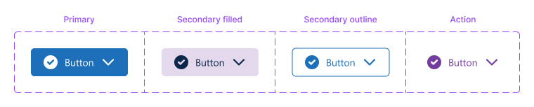
Design
ButtonType
There are four button types:
- Primary
- Secondary filled
- Secondary outline
- Action
VisualStates
VisualStates are related to user interactions. The button has three visual states: 1) Normal 2) Pressed 3) Disabled.
The Pressed VisualState is by default one shade darker as the Normal VisualState
Icons – Left and Right
A button can have an icon on the left and/or right.
- Icons can be used for dual coding so that the content of the button is easier to interpret for your enduser.
- Another scenario for using an icon is to create the visualisation of a dropdown button.
To set an icon:
- Showing the left/right icon is done at the Button component itself
- Setting the icon sources is done at the nested component Button XDS
Icon Button
A button with only an icon can be created in Figma by setting:
- HasRightIcon and HasText to False and
- HasLeftIcon to True
Text
A button has the possibility to include text. Whether the text is shown, is set with the HasText property at
the Button component itself. The content is set at the text property in the nested component Button XDS.
Other customizations
Besides the predefined properties within Figma, there are a few other things that can be customised. For any combination of ButtonType
and VisualState the following properties can be changed:
| Property | Description |
|---|---|
| BackgroundColor | BackgroundColor of the Button. |
| TextColor | Color of the Text of the Button. |
| BorderColor | Color of the outer border. |
| InnerBorderColor | Color of the inner border. |
| BorderWidth | Width of the border of the outer border of the Button. |
| LeftIconTint | Color of the left icon of the Button. |
| RightIconTint | Color of the right icon of the Button. |