Skip to content
Specs
Anatomy
- Left Icon (optional). Can be used for dual coding in combination with a label
- Right Icon (optional). Can be used for dual coding or to simulate a dropdown button with a chevron icon.
- Label (optional). Text within the button.
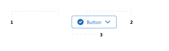
Alignment
- By default, all elements are centre aligned and the width of the button is determined by the content within.
Behavior
- By default, the button grows when the content within the button grows.
- Has VisualStates are based on the enduser interaction.
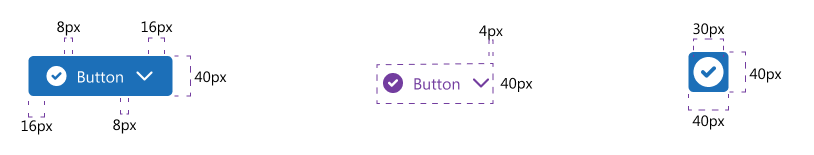
Measurements
- The textSize that is used is Paragraph Normal.
- The icons have a size of 24×24 px.